Pulse
The challenge
Gift-card marketplaces compete on trust. Real money in, digital codes out, instantly. The platform either feels like it can be trusted with that, or it doesn't.
Two years into V1, Pulse had outgrown its MVP. The platform had run live, attracted users, and revealed exactly what to build next: payment journeys that needed depth, functionality MVP had deliberately deferred, and a brand with more range than the launch could justify.

Approach
V2 wasn't a refresh. The platform was rebuilt around two years of real user behaviour, designed for what Pulse has become rather than what it could afford to be at MVP.

What was delivered
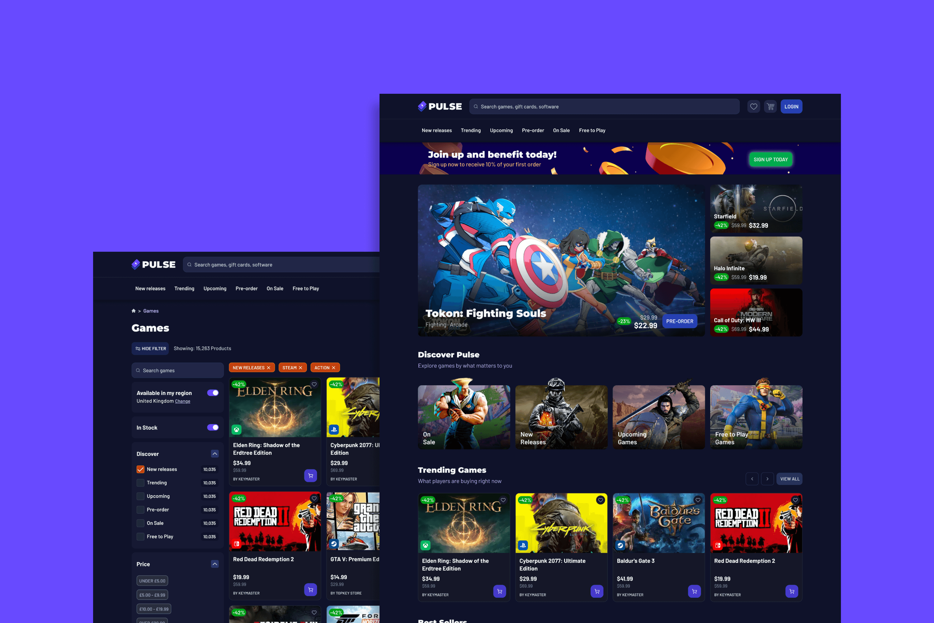
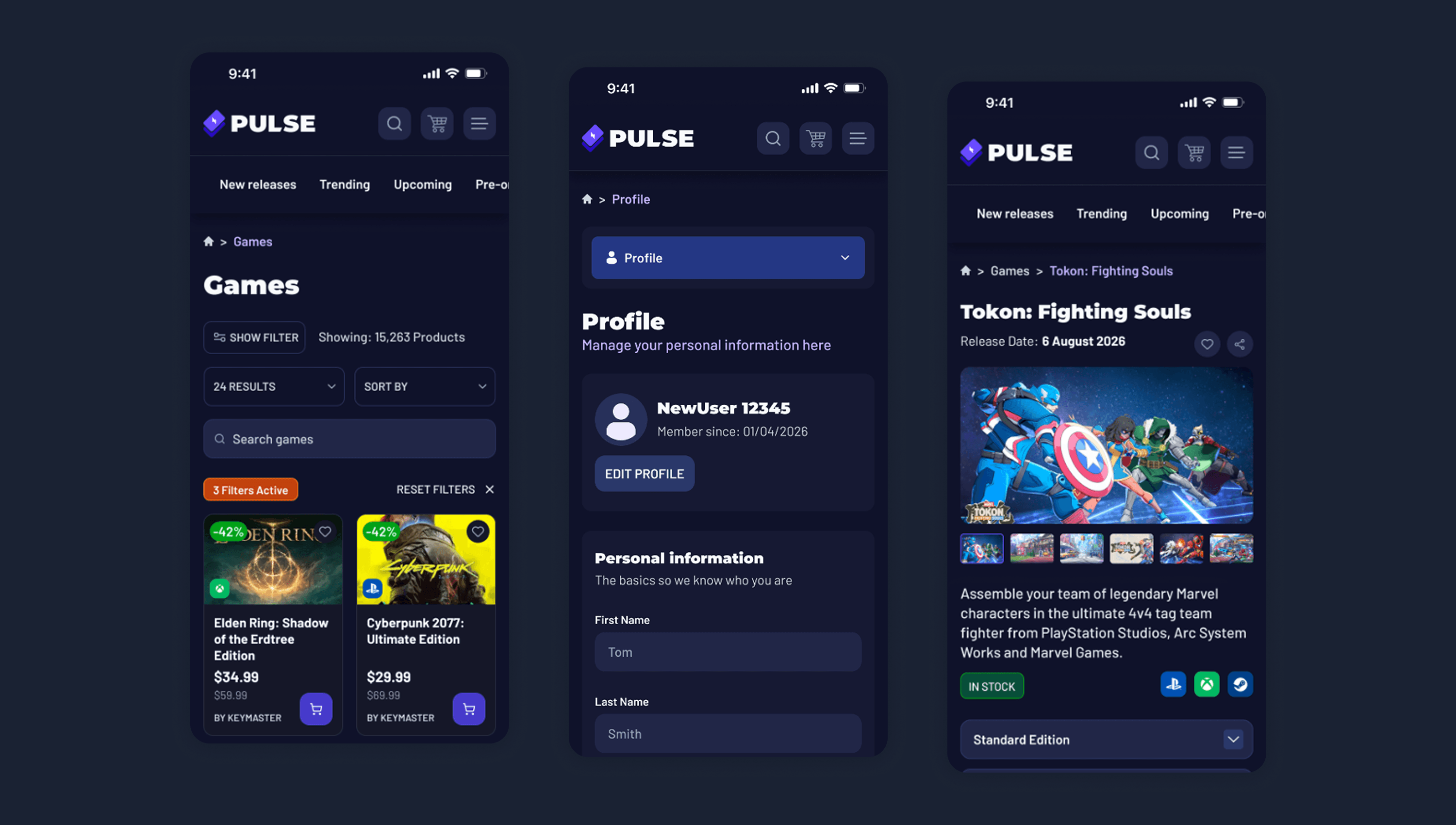
A complete rebuild from the ground up. Two years of real product use, folded into every screen.
Brand evolution
Original mark extended into a full palette and typography reset. Same DNA, broader range, designed for the platform Pulse has become.
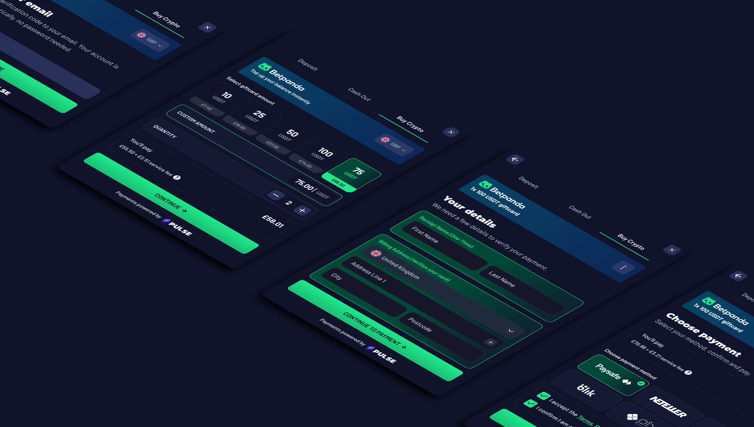
Payment journeys reworked
Checkout, refund, and transaction flows redesigned end-to-end. Friction removed where MVP had to compromise to ship.
Functional depth
Account system, OpenCritic integration, and rationalised auth folded into the platform. The functionality two years of real users had asked for, ready at launch.
Discovery rebuilt
Navigation architecture redesigned around how users actually browse. Discovery surfaces promoted, utility moved to footer, mobile resolved as horizontal chips. Two years of behaviour informed where things live.


Outcome
V1 has been live for two years, the foundation that earned this next step. V2 ships shortly, designed for what Pulse has become rather than what it could afford to be at MVP.